Vintage Food Signs
We are a part of eBay Affiliate Network, and if you make a purchase through the links on our site we earn affiliate commission.
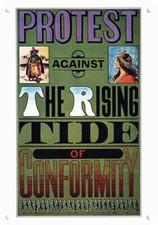
Before radio and television commercials, signs were the medium of choice to promote packaged food brands. Country stores were packed with advertisements, as companies developed increasingly complex countertop displays and gigantic wall signs to...
Continue readingBefore radio and television commercials, signs were the medium of choice to promote packaged food brands. Country stores were packed with advertisements, as companies developed increasingly complex countertop displays and gigantic wall signs to draw attention away from their competitors. Many highly collectible vintage signs featured food brands that are still in business today, among them Morton Salt, Campbell's Soup, Wonder Bread, Dairy Queen, Sunkist, Borden's, and Planter's Nuts.
Milk and dairy signs often included the requisite cow to show that the products being advertised were farm fresh. For example, the N.P. Hood & Sons logo featured the face of a friendly calf at its center. Butter and margarine makers, like Equity and Deer Creek, appropriated the rolling meadows and open air of the countryside to make their case. Another common motif highlighted Native American characters and scenes, implying the authentic, enduring appeal of brands like Five Roses Flour or Land O’ Lakes Butter.
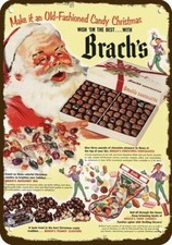
With the expanding popularity of in-store soda fountains during the first half of the 20th century, a plethora of delicious sweets were hawked on signs for brands like Sealtest, Mellow Gold, Fairmont, Wrigley’s, Beech-Nut, Woodward’s, Old Glory, Kis-Me, and Schrafft’s. Dessert manufacturers bought into the bovine-marketing approach as well, with ice cream makers like Hershey’s and Borden’s relying on a dairy cow to lure eyeballs to its early ads. Though most food companies shied away from portraying edibles on their signs, dessert makers like Mansion House Ice Cream frequently portrayed mouth-watering graphics of their frozen treats.
Mischievous children often adorned the artwork promoting foodstuffs, especially signs for baked goods. From the yellow-raincoat clad Uneeda Biscuit boy to the curly-headed Red-Top Flour girl to the Butter Nut Bread urchins, tots with a twinkle in their eyes and a snack in their hands really sold food. Along with children, animals were...
Continue readingBest of the Web

Falvo Collectables Gallery
Ralph and Carol Falvo's excellent collection of automobiles, petroliana, jukeboxes, soda, and...

Historical Marker Database
If you're the type who pulls over when you see a 'historic marker ahead' sign, you'll love this...


Most Watched


Best of the Web
Falvo Collectables Gallery
Ralph and Carol Falvo's excellent collection of automobiles, petroliana, jukeboxes, soda, and...
Historical Marker Database
If you're the type who pulls over when you see a 'historic marker ahead' sign, you'll love this...